
You just lost a client because your pricing page made them guess
You’ve left your pricing page up at 10pm. A prospect clicks through, scans your services, and looks for a number. Instead they see Contact us for pricing or a link to a PDF. They don’t want to fill out a form. They want an answer now. So they leave. That loss happens more often than you think.
When pricing isn’t upfront, you make the prospect work for information. In a world where speed matters, any friction can kill a sale. HubSpot found that 69% of buyers expect pricing to be easy to find on a website. If they have to hunt, they go to a competitor who shows the numbers. That’s especially true for small businesses and solo owners who value transparency.
Hiding pricing often comes from fear of scaring people off. But the opposite is true. Clear pricing builds trust. It shows you respect their time. Even if your prices are high, being upfront filters out tire-kickers and attracts serious buyers. Letting prospects guess usually backfires, they assume it’s too expensive and leave without engaging.

Your pricing page is a critical step in the customer journey. It’s where interest turns into consideration. If that step is murky, you lose momentum. Make it as easy as possible for someone to say yes. Clear, visible pricing is the easiest way to remove a barrier. If your conversion rates are low, check your pricing page.
The Cost of a PDF Pricing Sheet
Many businesses put pricing in a downloadable PDF. They think it looks professional or gives flexibility to change prices without updating the website. But from the customer’s view, a PDF is a roadblock. It asks for an extra click, a download, sometimes a file viewer. On mobile, PDFs load slowly and are hard to read. You’re asking a prospect to do work when they’re not that invested yet.
A PDF is also static. It doesn’t show tiers, add-ons, or custom options dynamically. If a customer needs to match a plan to their needs, they have to cross-reference the PDF with your features page. That’s cognitive load. Salesforce found that 78% of buyers expect personalized engagement based on their needs. A one-size-fits-all PDF fails that.
Think about the experience: a user lands on your site, gets interested, clicks Pricing, and sees a PDF. They open it, three pages with terms and conditions. They close it. They’re not reading fine print at 10pm. They want a simple table or clear statement. Our plans start at $29/month. That converts. Anything more is a distraction.
Worried about competitors seeing your prices? They can always ask. Transparency is a competitive advantage, not a weakness. Hiding prices signals you’re not confident in your value. You also miss the chance to test and optimize pricing. Ditch the PDF. Put your pricing on a live page, make it scannable and mobile-friendly, and include a call to action.

How AI Chat Support Can Capture the Late-Night Visitor
Remember that 10pm visitor who left because pricing wasn’t clear? What if you could catch them before they leave? A well-designed chatbot can pop up when someone lingers on your services page or hovers over the back button. It can ask, Need help? I can show you our pricing in seconds. That simple intervention can salvage the prospect.
Imagine the chatbot answering: Our plans start at $49/month. Would you like to see a comparison? With one click, pricing appears in the chat window. No PDF, no form. The user stays engaged. The chatbot can also collect an email or book a consultation. It’s like a sales rep available 24/7. For a solo owner, that’s a game changer. You can’t be online all hours, but your AI can.
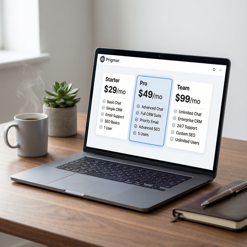
This isn’t just about pricing, it’s about the whole experience. Many visitors have questions a chatbot can answer instantly: How does the free trial work?, Is there a setup fee?, Do you offer discounts for nonprofits? By providing quick answers, you build trust and move the sale forward. Pricing is transparent on Prigmar’s site; if it’s not on yours, a chatbot can bridge the gap.
Prigmar’s chat agent pulls from your knowledge base, product info, blog posts, and FAQ, and replies in your brand voice. It can qualify leads and hand them to you when they’re ready. For a small business owner, it’s like cloning yourself. You focus on deep work while the chatbot handles the 10pm visitor. More captured leads, fewer lost clients. If your pricing page is still a PDF, pair it with a chatbot, but update the page first.
Simplicity Wins: Make Your Pricing Page a No-Guess Zone

The best pricing pages are simple, clear, direct. They use plain language, highlight the most popular plan, and include a comparison table. No jargon or disclaimers up front. Answer How much? in two seconds. Once the prospect knows it’s affordable, they’ll read more. If it’s a little above budget, they might still contact you.
Follow these principles: use a pricing table with three options, state what’s included, and always include a call-to-action button. Use money-back guarantees or free trials to lower risk. Test different layouts, annual versus monthly, per seat versus flat fee. Small changes affect conversion. You could even write a LinkedIn post about Why we made our pricing transparent to build trust.
If you offer multiple products or add-ons, keep it simple. Too many choices cause paralysis, the Paradox of Choice. Limit to 3-4 plans. Add a Most Popular badge to guide decisions. Always offer an entry-level price to get people started. You can upsell later. The goal is a “Yes”, even a small one.
Place testimonials or case studies near your pricing. Social proof validates your price. If others are happy paying, the prospect feels safer. Consider a Guaranteed badge or refund policy. When comparing Prigmar vs competitors, you win on value, but the prospect needs to see that. Make it obvious with a comparison table, but keep it clean. No walls of text. Your pricing page should be as easy as reading a menu.
Transform Your Pricing Page with These Actionable Steps
Ready to fix your pricing page? Start by auditing your current state. Open your site on mobile and desktop. Walk through it like a new visitor. How many clicks to see a price? If more than one, you have room to improve. Ask a friend to find your pricing and time them. If it takes more than 10 seconds, you have a problem.
Decide whether to use flat rates, tiered plans, or custom quotes. Many services work best with tiers. A single service can use a flat rate with add-ons. Put the price where it’s visible, above the fold on mobile. Don’t hide it below the fold. Make Pricing a prominent menu item.
Write clear descriptions for each plan. Avoid vague names like Basic, “Pro”, Enterprise. Use benefit-driven names like Starter, Growth, Scale. Include key features, but not everything, highlight the top differentiators. Includes AI chat support, email marketing, and CRM beats a long list.
Add a chatbot to catch stragglers. If someone stays on the pricing page for more than 30 seconds, trigger a chat: Need help choosing? I’m here. The chatbot can answer questions, send a PDF if they insist, or book a call. Prigmar’s AI chat support software for small business makes this easy. And with Prigmar’s AI business management software for solo owners, you can automate the whole flow. Visible pricing, chatbot ready, lead captured.
Every second a visitor spends guessing your price is a second they could spend on a competitor’s site. Stop making them guess. Show what it costs. Show why it’s worth it. If they still have questions, let your AI handle them. Your future clients will appreciate it.